
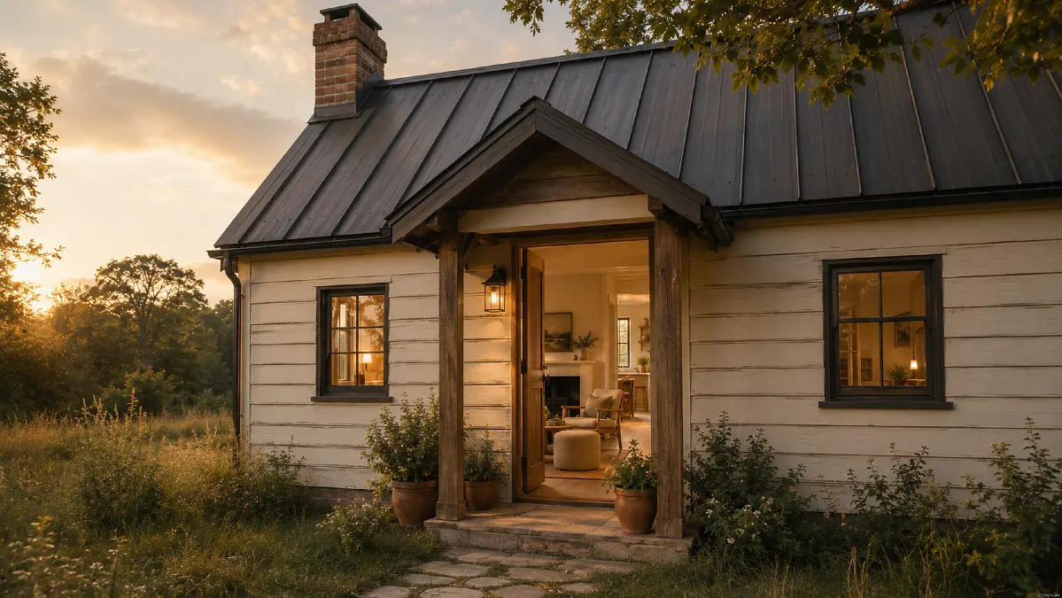
Small cottages can disappoint you before the decorating even starts.
The rooms may feel dark. Storage is limited. A normal sofa blocks the walkway, while tiny furniture can leave the home feeling more like a display than a place where someone truly lives.
That is why this cottage is so interesting.
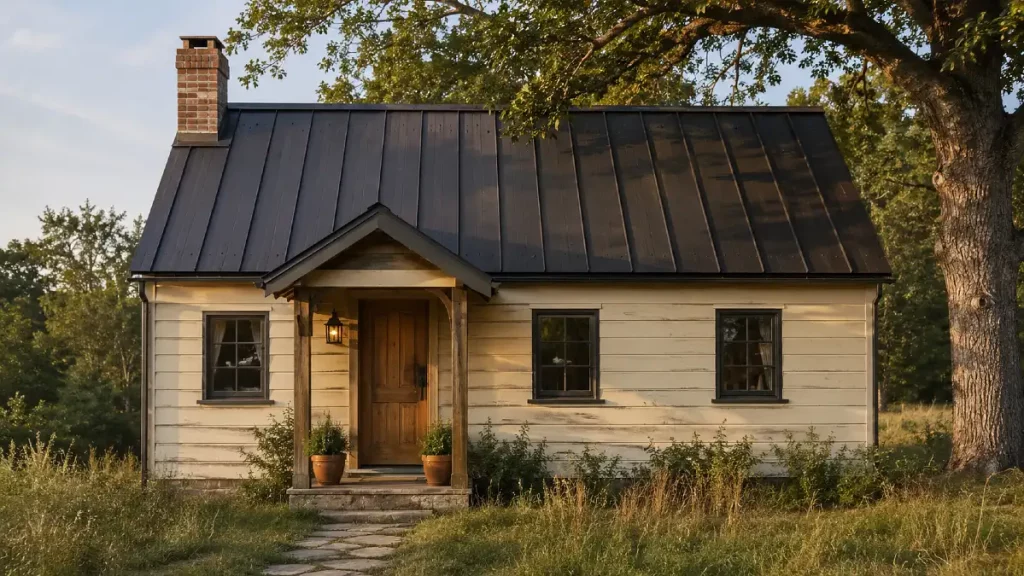
From the road, it looks like a simple country home. It has cream siding, a steep charcoal roof, a small front porch, and one warm oak door. There is no grand tower, huge glass wall, or dramatic modern extension.
Step inside, though, and the cottage feels rich, open, and carefully planned.
Why the Plain Exterior Makes the Interior More Surprising
The cottage keeps its best features hidden.
Its exterior is a simple rectangular form with a steep roof and one small rear extension. The siding is painted a soft cream rather than bright white. Dark bronze gutters and window frames add definition without making the house look heavy.
A narrow stone path leads to a covered porch. The porch is deep enough for one wooden bench, two clay pots, and a wall lantern. That is all it needs.
The natural oak front door is the first clue that warmer materials wait inside.
This restraint works because every exterior detail has a clear job. The roof sheds rain. The porch protects the entrance. The cream siding reflects light. The simple windows suit the cottage’s scale.
There is no fake trim added just to make the home seem older.
Sherwin Williams named Universal Khaki SW 6150 its 2026 Color of the Year, describing it as a warm neutral that works with natural wood and other grounded finishes. A shade in this family could give the siding a softer look than plain white while still keeping the cottage calm.
The result feels ordinary in the best way. It belongs in its setting.
That quiet exterior also makes the first view through the door much more powerful.
How the Entry Opens Into a Living Room That Feels Larger
The front door does not open onto a cramped hallway.
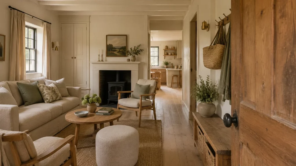
Instead, it reveals one clear view through the living room and toward the kitchen window at the back. That long sight line makes the floor plan feel deeper from the moment you enter.
A slim oak bench sits beside the door. It gives you a place to remove shoes and hides baskets below. Pegs above hold coats, while a narrow shelf keeps keys from spreading across the living room.
The main seating area begins several feet beyond the entrance.
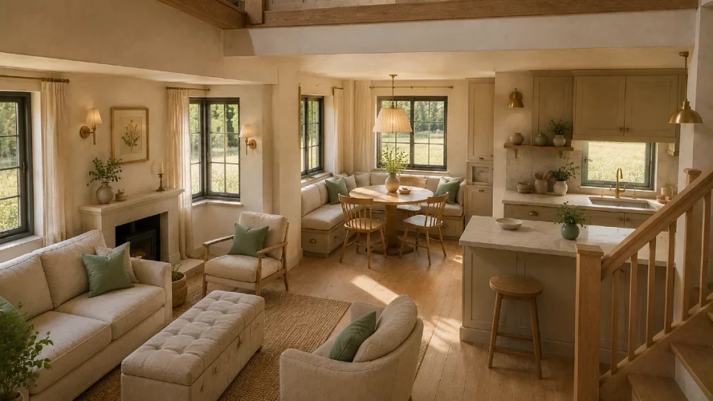
A full depth oatmeal linen sofa sits against the longest wall. It is compact, but it is not a stiff miniature sofa. Two people can sit on it without feeling squeezed.
Across from it, a pair of rounded oak chairs creates extra seating. Their open arms allow you to see more of the floor, which keeps the room from looking blocked.
A storage ottoman takes the place of a large coffee table. It holds blankets, provides a soft footrest, and can become an extra seat.
IKEA recommends furniture that performs two jobs in very small living rooms, including storage pouffes and seating that can also become a bed. The idea is useful even when you choose pieces from another retailer. Every large item should earn the floor space it uses.
The fireplace wall adds character without stealing much room. A shallow cream plaster surround frames a small black wood stove. Built in cupboards fill the lower spaces on both sides.
Open shelves appear only above the cupboards.
That balance matters. A few books and pottery pieces create charm. Closed doors hide chargers, games, extra candles, and the less attractive parts of daily life.
The ceiling beams are kept close to the wall color. Dark beams might look dramatic, but they could make this low room feel divided.
Curtains hang close to the ceiling rather than directly above the windows. The extra height leads the eye upward. Soft linen panels also add warmth without blocking much daylight.
At night, the room uses several small lights:
- Two aged brass wall sconces
- One shaded floor lamp beside the sofa
- A table lamp on the built in cabinet
- A small light above the entry bench
The cottage does not depend on one bright ceiling fixture. The softer light makes the living room feel deeper and more comfortable.
The Small Kitchen Trick That Creates More Work Space
The kitchen looks larger because it does not try to fill every wall.
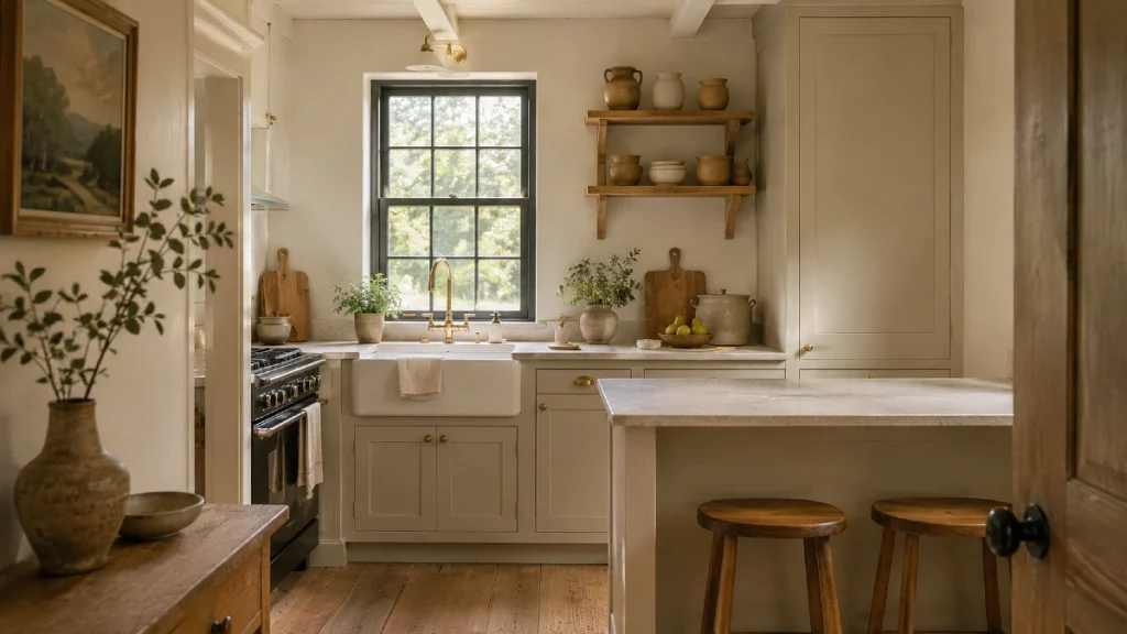
Most cabinets sit along one side of the cottage. A short peninsula turns out from the wall, giving the cook extra work space without forming a bulky island in the middle of the room.
The peninsula is narrow enough to preserve a comfortable route to the back door. It contains drawers on the kitchen side and a small open shelf at the end.
Two stools can slide under the outer edge.
This creates a place for breakfast, meal preparation, or a guest who wants to talk without standing in the cooking area.
The cabinet color is a warm putty shade. It sits between beige, soft brown, and muted gray. Cream walls keep the space bright, while a pale stone counter adds a quiet contrast.
Sherwin Williams describes Universal Khaki SW 6150 as a warm neutral that celebrates simple, lasting materials. Its 2026 collection also pairs this family of color with shades such as Creamy, Neutral Ground, and Still Water. These tones support a cottage palette without forcing every surface to be white.
A warm neutral kitchen is also forgiving. Small marks and everyday wear may be less obvious than they would be on sharp white cabinets.
The tall pantry stands at the far end of the cabinet run. Placing the largest unit there keeps it from breaking the main view into the room.
Upper cabinets reach close to the ceiling. This gives the cottage more storage and avoids the dusty empty strip that often appears above shorter cabinets.
There is one open shelf near the sink, but the whole kitchen is not open storage.
That is an honest choice. Open shelves look beautiful when they hold a few matching bowls and mugs. They can feel messy when they must carry every plate, food package, bottle, and appliance.
The kitchen saves open storage for items used every day.
A warm walnut tone appears on the shelf, stools, and a small section of the counter. Sherwin Williams has also paired its 2026 color direction with Minwax Special Walnut MW 224, a true brown stain intended to highlight natural wood grain.
The small sink sits below the rear window. The range is placed farther along the same wall, with a narrow work zone between them.
This arrangement is simple, but it works. You can wash, prepare, cook, and serve without crossing the room again and again.
Why the Hidden Dining Nook Works for Four People
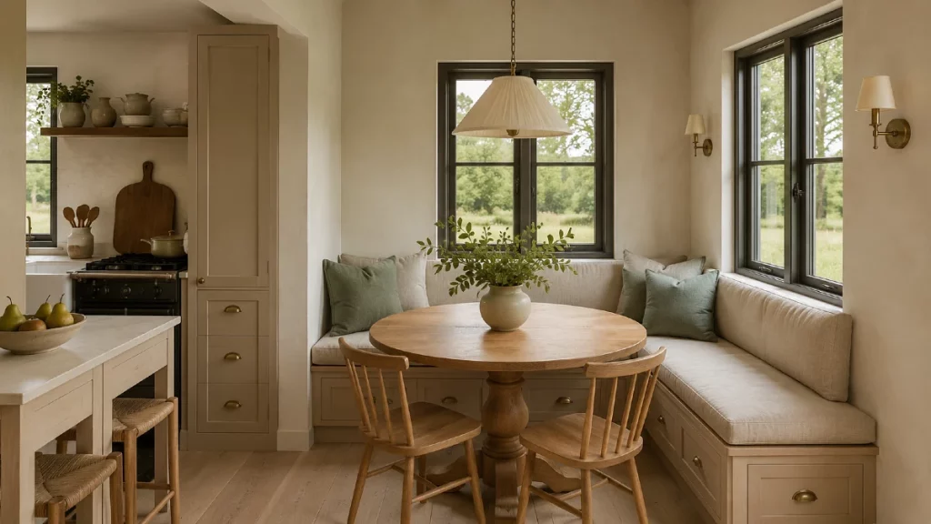
The dining area occupies a corner that might otherwise become a walkway.
A built in bench wraps around two walls beside a pair of windows. Its cushions use the same oatmeal linen found on the living room sofa, which helps the open floor plan feel connected.
A round oak pedestal table sits in the center.
The single base gives your legs more room than four table legs would. It also allows two lightweight chairs to move easily when someone needs to enter the bench.
Four people can sit here for dinner. A fifth person could fit for coffee, but the nook would start to feel tight.
That limit is worth admitting. Small dining areas work best when they are planned for normal daily use instead of the largest event you might host once a year.
Deep drawers under the bench store:
- Table linens
- Serving bowls
- Board games
- Extra candles
- Small kitchen appliances
This removes pressure from the kitchen cabinets.
A single pleated pendant hangs above the table. It creates a clear center without filling the ceiling with several fixtures.
The pendant is high enough to keep the view through the room open. Its fabric shade softens the light and repeats the texture of the curtains.
The windows do much of the visual work.
During the day, they frame a small garden and make the dining nook feel connected to the outdoor space. At night, Roman shades provide privacy without adding large folds of fabric beside the bench.
The wall above the backrest holds one framed landscape. A crowded gallery wall could make the corner feel busy.
Here, one larger piece gives the eye somewhere to rest.
The smartest detail is the bench depth. It is deep enough to sit comfortably but not so deep that diners must climb across the cushions to reach the table.
Built in seating can save space, but only when its measurements suit real bodies and normal movement.
How the Bedroom Fits Real Storage Without Feeling Packed
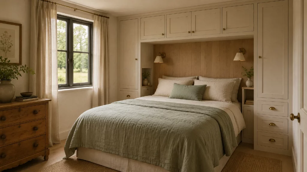
The bedroom does not depend on a tiny bed to make the floor plan work.
It holds a comfortable queen size bed, but the furniture around it is built into the wall. This removes the gaps, bulky corners, and wasted strips of floor that often appear between separate wardrobes and bedside tables.
Shallow cabinets rise on both sides of the bed. A row of cupboards crosses the wall above the headboard.
The center is lined with oak, creating a warm frame around the bed.
Small open niches replace bedside tables. Each niche has space for a book, a glass of water, and a phone. A brass reading light is mounted above it.
This keeps the floor clear and makes cleaning easier.
The bed base contains wide drawers for extra bedding and seasonal clothes. A full height wardrobe fills a recess near the door.
Closed storage is one reason the room feels calm. Clothes, bags, and spare bedding do not become part of the decoration.
The walls are painted a creamy off white. The built in cabinets use the same color, so they blend into the room rather than looking like a second wall of furniture.
A soft sage green linen cover adds color to the bed. The shade appears again in a small Roman blind and one framed botanical print.
The room has only one freestanding chest.
That piece is old pine with visible wear. It adds the age and texture that new built ins can lack.
The full height curtains match the living room. Repeating them gives the cottage a clear visual rhythm.
This bedroom plan has one downside. Built in storage costs more than basic freestanding furniture, and it cannot move with you.
A lower cost version could use two matching narrow wardrobes, a storage bed, and wall mounted reading lights. Painting the wardrobes the same color as the walls would help them recede.
The goal is not to copy every cabinet.
The goal is to reduce the number of separate shapes competing for space.
The Bathroom Design That Makes a Narrow Room Feel Calm
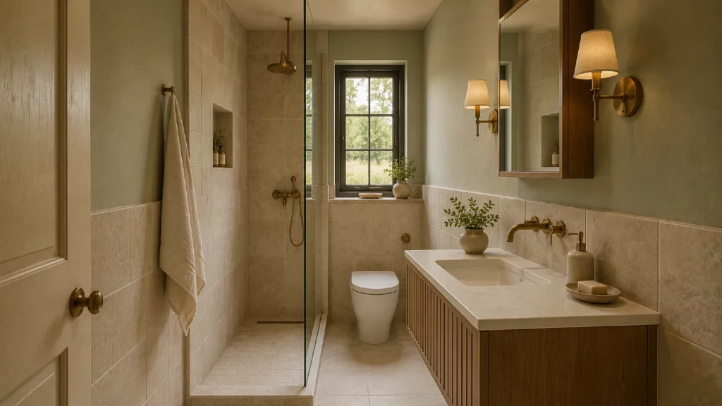
The bathroom is long and narrow, so the design avoids sharp visual breaks.
Pale limestone style porcelain covers the floor and continues into the shower. Using the same surface makes the room feel less divided.
A clear glass panel protects the shower without hiding the back wall.
The eye can travel to the full depth of the bathroom, which makes the room feel longer. The glass also allows daylight from the window to reach the vanity area.
The vanity floats above the floor.
This exposes more tile and makes cleaning easier. Its fluted oak front adds texture, while the slim white counter keeps the top simple.
A recessed mirrored cabinet provides storage above the sink. It holds toiletries without projecting far into the room.
The toilet sits beside a shallow ledge built into the wall. The ledge creates space for one small plant and hides part of the plumbing.
Color appears above the tile in a muted gray green. It is soft enough to work with the limestone tone but strong enough to keep the bathroom from feeling plain.
Sherwin Williams’ 2026 forecast included fresh greens, with design coverage noting their usefulness in bathrooms where calm, translucent color can support a quieter mood.
The room uses warm white lighting rather than cold blue light. Wall lights sit on both sides of the mirror, which is more useful for faces than one lamp placed directly overhead.
The shower niche is built into the wall. Bottles stay off the floor and do not require a hanging rack.
A small bathroom still needs strong ventilation.
Warm materials and soft colors will not solve damp towels, fogged mirrors, or trapped moisture. An effective exhaust fan matters more than an extra decorative feature.
The glass panel also needs regular cleaning. Anyone who dislikes visible water marks may prefer a textured glass panel or a washable shower curtain.
Good design includes the work required to maintain it.
The Loft Reading Room Uses the Cottage’s Hardest Space
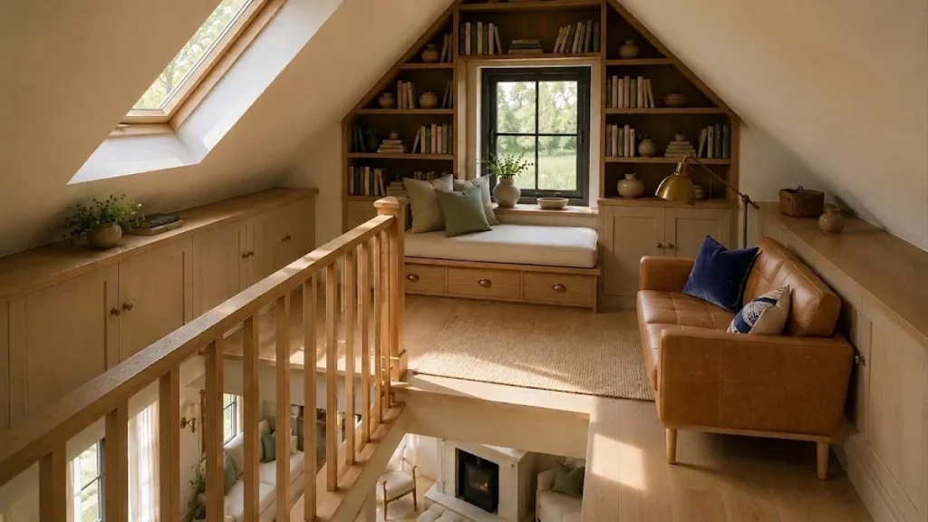
The steep roof creates a low loft above part of the living room.
Instead of forcing a second bedroom into that space, the cottage uses it as a reading room and occasional guest area.
This choice makes the loft more comfortable.
A built in window seat sits beneath the highest part of the roof. Deep drawers below store bedding, while a fitted cushion turns the seat into a place to read during the day.
A small roof window brings daylight into the center.
Low cupboards run beneath the sloped walls. This is where the roof height is least useful for walking but still useful for storage.
Bookshelves fill one gable wall. They stop below the roof angle, which makes them feel part of the architecture.
A slim oak railing overlooks the living room. Its vertical sections allow light to pass through while keeping the edge secure.
The same cream paint, oak wood, sage textiles, and brass lighting appear here. The repeated materials stop the loft from feeling like a separate attic.
One small swivel chair sits beside the window seat. A round table holds a reading lamp and a cup.
There is no large desk, wide sofa, or row of decorative furniture.
The empty floor is part of the design.
When a guest stays overnight, the window seat can become a single sleeping area. A folding screen provides some privacy, though it will never feel as private as a closed bedroom.
The loft also needs safe access.
A fixed staircase with a handrail is easier to use than a ladder, especially for children, older adults, or anyone carrying bedding. The railing height, stair measurements, ventilation, and emergency exit must follow local building rules.
A charming photo should never replace a safe construction plan.
7 Design Rules You Can Borrow From This Tiny Cottage
The cottage works because the rooms follow the same small set of rules.
You can use them in an apartment, guest house, cabin, or normal family home.
1. Repeat a Short Material List
The same oak, cream paint, aged brass, sage fabric, and pale stone appear across the cottage.
Repetition creates order. It also makes a small home feel like one complete space instead of several unrelated boxes.
Choose three main finishes and two supporting colors before you shop.
2. Buy Fewer Pieces With Better Functions
A storage ottoman is more useful here than a coffee table with no storage.
A dining bench stores serving pieces. The peninsula serves as a work surface and breakfast bar. The window seat becomes a guest bed.
IKEA’s small room guidance follows the same principle by recommending flexible furniture that performs more than one task.
3. Protect the Main Walkways
The cottage keeps a clear route from the front door to the kitchen and rear exit.
Before buying furniture, mark its full size on the floor with painter’s tape. Walk around the outline for a day or two.
Include the space needed to open doors, drawers, and chairs.
4. Use Open Storage in Small Amounts
A few open shelves make a room feel personal.
Too many can make the whole cottage feel busy. Use them for attractive objects and daily items. Put food packaging, cables, cleaning products, and extra supplies behind doors.
5. Light the Corners
One bright ceiling light can leave the edges of a room dark.
Place smaller lamps near chairs, counters, beds, and shelves. A room often feels larger when its corners remain visible after sunset.
6. Let Full Size Comfort Win
Small rooms do not require uncomfortable furniture.
Keep the sofa deep enough to relax on and the bed large enough for normal sleep. Save space by reducing the number of pieces, choosing built ins, or removing furniture that adds little value.
7. Test Every Paint Color in the Real Room
Warm neutrals can change under northern light, warm bulbs, and nearby wood.
Sherwin Williams notes that neutral colors with moderate light reflectance can help create a clean, inviting result, but the room’s direction and lighting still affect how each shade appears.
Use a large sample instead of choosing from a tiny paper chip.
Move it between walls and check it in the morning, afternoon, and evening. Sherwin Williams offers both a digital ColorSnap tool and tinted samples for testing ideas before buying a full amount of paint.
Tiny Cottage Design Ideas at a Glance
| Cottage Area | Smart Design Choice | Why It Works | Easy Idea to Borrow |
|---|---|---|---|
| Exterior | Cream siding, dark roof, and simple oak door | The modest outside makes the warm interior feel more surprising | Keep the exterior calm and use one natural material for warmth |
| Living Room | Compact sofa, rounded chairs, and storage ottoman | Comfortable furniture fits without blocking the main walkway | Choose fewer pieces that provide seating and storage |
| Kitchen | Single wall cabinets with a narrow peninsula | The layout adds counter space while keeping the room open | Use a slim breakfast counter instead of a large island |
| Dining Nook | Built in bench with drawers and a round table | Corner seating uses less floor space and adds hidden storage | Place a storage bench beside a window |
| Bedroom | Bed framed by shallow cabinets and upper cupboards | Built in storage removes the need for several bulky pieces | Paint wardrobes the same color as the walls |
| Bathroom | Continuous pale tile and a clear shower panel | Fewer visual breaks make the narrow room feel longer | Repeat one tile across the floor and shower |
| Loft | Low cupboards, bookshelves, and a fitted window seat | Difficult roof space becomes useful storage and seating | Place cabinets under slopes where standing space is limited |
| Whole Cottage | Repeated oak, cream, sage, brass, and linen | A limited palette connects every room and reduces visual clutter | Repeat three main materials and two accent colors throughout |
A Small Cottage Can Still Feel Generous
This cottage does not feel special because every surface is expensive.
It feels special because each decision supports the next one. The plain exterior creates surprise. The open sight line adds depth. Built in storage reduces clutter. Warm materials keep the practical layout from feeling cold.
You do not need to copy the complete home.
Start with one useful change. Clear a main walkway. Replace an empty table with storage furniture. Repeat one wood tone across two rooms. Test a warmer wall color. Add a lamp to a dark corner.
A successful tiny cottage interior is less about squeezing in more decoration and more about deciding what deserves the limited space.
That is the real surprise waiting behind this ordinary front door.